While some features work great on the iPhone with iOS 15, it doesn't translate well to a Mac.
With each new macOS release, Apple continues to blur the line between desktop and mobile by offering similar features on both platforms. For the most part, this has worked. And yet, macOS Monterey has convinced me that not everything on mobile works on an iMac, MacBook, or any of the other best Macs.
Until now, I've enjoyed seeing mobile apps and features make their way to Mac from iPhone and iPad, including News, Maps, and redesigned versions of Photos and Messages. However, this time around, I've been much less impressed. From the radical Safari redesign that no one asked for to the introduction of Focus, some of Monterey's most prominent features seem much less useful here than they do on mobile.
The new Safari
My biggest beef with macOS Monterey has been Apple's many changes to Safari. Chief among these are the new Tab Groups, which are anything but user-friendly and can quickly become confusing. Some of the questions that float inside my head are, Why should we use tab groups over traditional bookmarks?, and Who was asking for this add-on?
Back in July, I said if Tab Groups were to catch on and replace bookmarks, I would be on board. But today, I'm starting to see these not as helpful but as a gimmick. If you recall, Apple decided not to wait until the release of macOS Monterey to bring the new Safari to the public. It's available through the Safari 15 update.
Do our Macs care at all about when we're working out at the gym? Are our lives that busy that we can't read a text from one of our friends in the middle of the day?
Already a shift
Interestingly, another new Safari feature on both Mac and mobile quickly went from a requirement to an option after a public outcry. The new compact tabs look is easy to turn off now, which reestablishes the original separate tabs format.
As the Daring Fireball recently noted: "I despise the new tabs... They don't look like tabs. They look like buttons."
Maybe a future macOS update will also allow us to turn Tab Groups off.
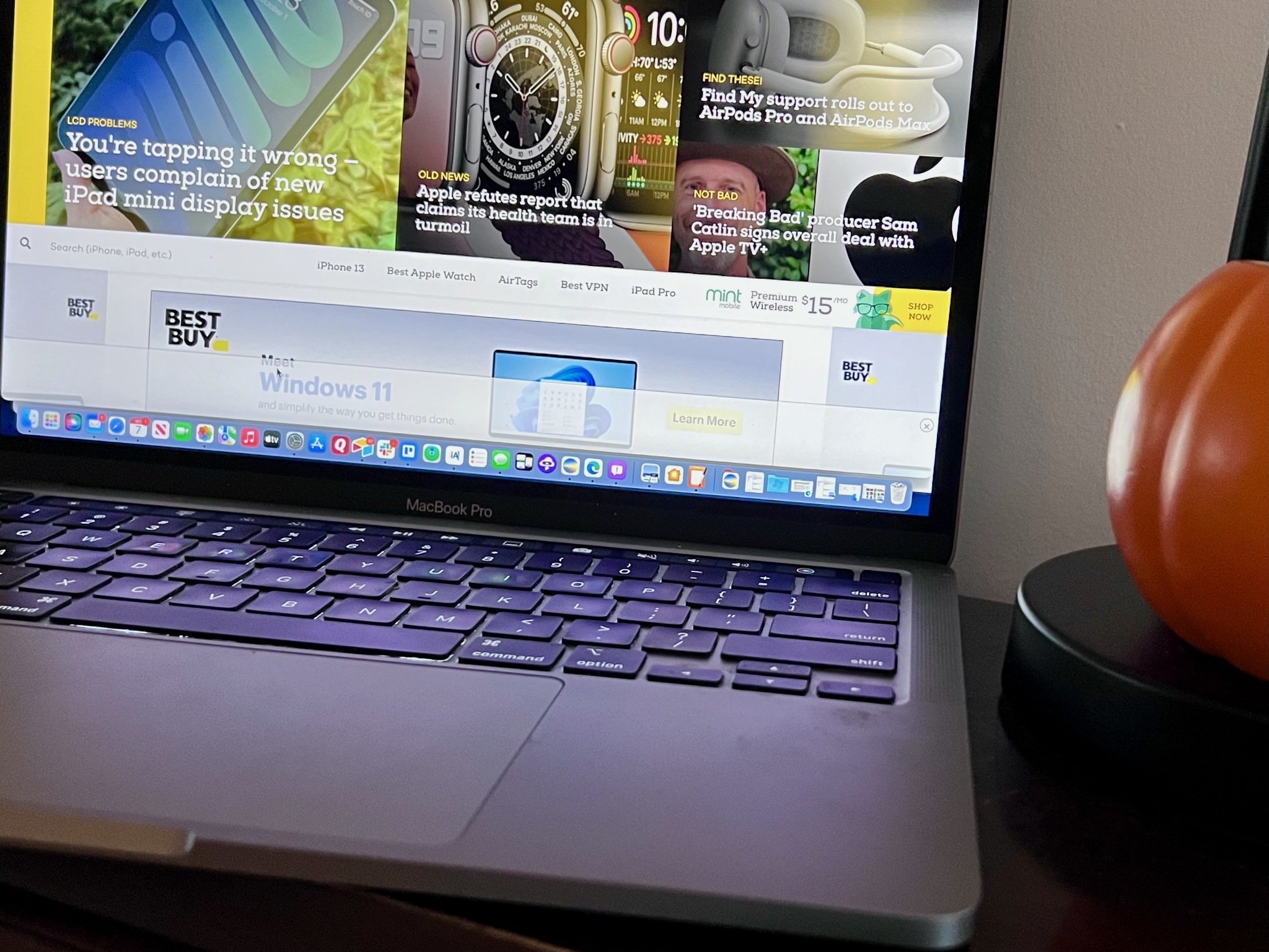
These same Tab groups feel much more helpful on iPhone, perhaps because of the smaller screen where real estate is limited. At least for now, I seem to be using Microsoft Edge much more often on my MacBook Pro. The Chromium-based browser seems faster and more reliable than Safari and much less confusing to travel between websites.
Focus
This brings me to Apple's new Focus tool.
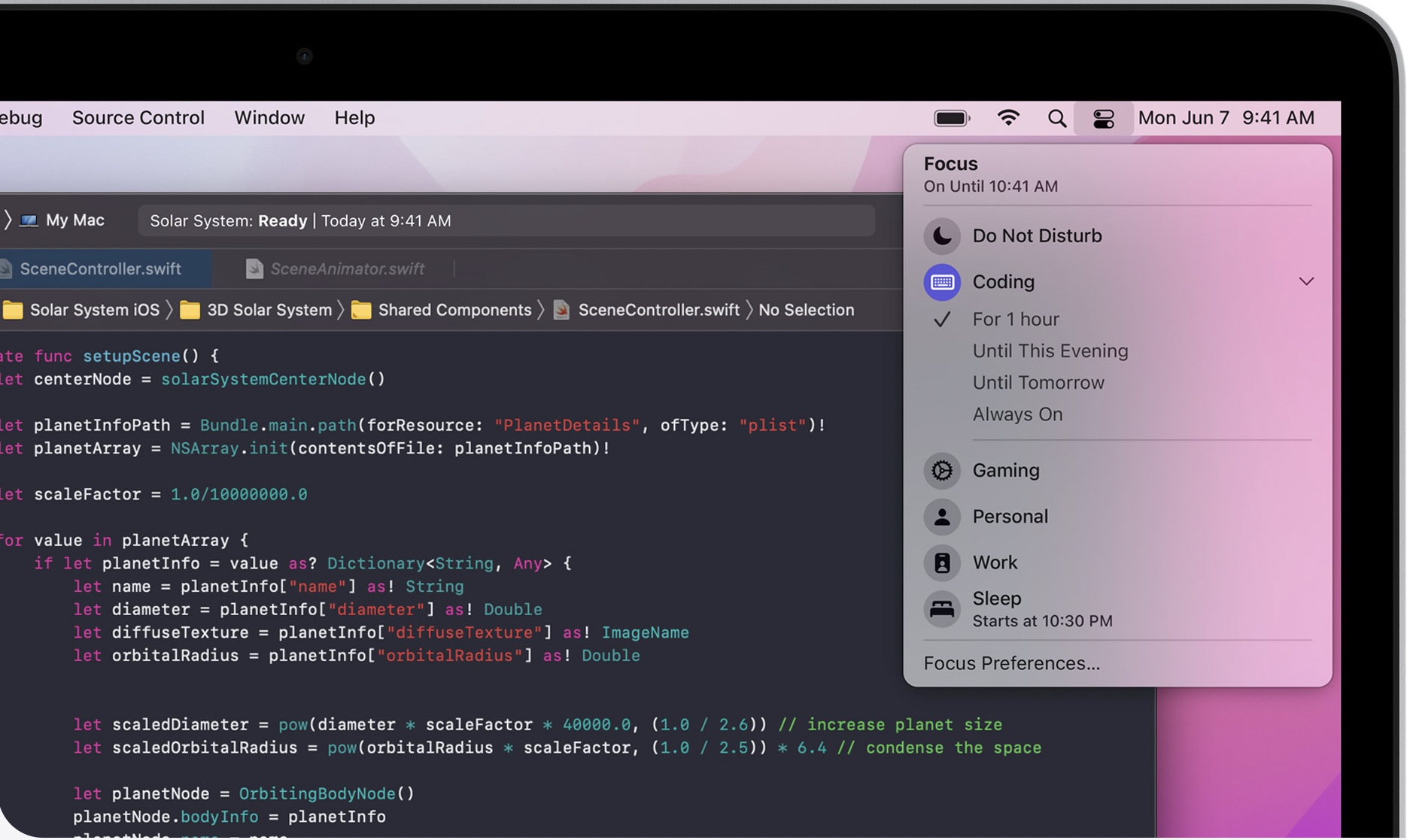
I've tried to fall in love with this new feature, designed to make it easier for users to concentrate on what they're doing throughout the day by silencing unnecessary notifications and alerts. Among the Focus Groups, you can create ones for Work, Sleep, Gaming, Exercise, and anything else you want.
My gripe isn't with the Focus feature itself, which is easy to set up in macOS Monterey. Instead, it's that it feels so unnecessary on desktop. Do we really need different Focus settings for work and sleep? Do our Macs care at all about when we're working out at the gym? Are our lives that busy that we can't read a text from one of our friends in the middle of the day?
Now you're probably thinking, 'Bryan, just turn Focus off on your Mac.' And yes, that's exactly what I'll do when macOS Monterey arrives. Regardless, I'm sticking with the position Focus is nearly perfect on iPhone, but much less necessary on macOS.
Other issues
Safari changes and Focus aren't the only features that don't translate well to macOS. For example, Notification Center, which seems essential on iPhone, is much less so on Mac. I believe this feeling is tied to how Apple has hidden the feature behind the clock on the top right of the menu bar. And yes, I'm still annoyed with how Apple broke up what was once iTunes so that we have separate Music, Podcasts, and Apple TV apps. Again, this makes sense on mobile, but a little bit less so on a desktop.
It's not all bad
I've been using beta versions of macOS Monterey since June and plan on reviewing when it's released to the public. Shared with You and the all-new Quick Note are just two of the new features that work almost flawlessly on desktop and mobile, and are also useful on both platforms.
However, moving forward, Apple would be wise to put on the brakes with its desire to make macOS even more like iOS. With all the obvious low-hanging fruit picked, it's becoming much harder to find features that translate effectively across both platforms.
Otherwise, Apple should merge them all into one universal OS and be done with it. Let's hope that day never comes, however.


0 Commentaires